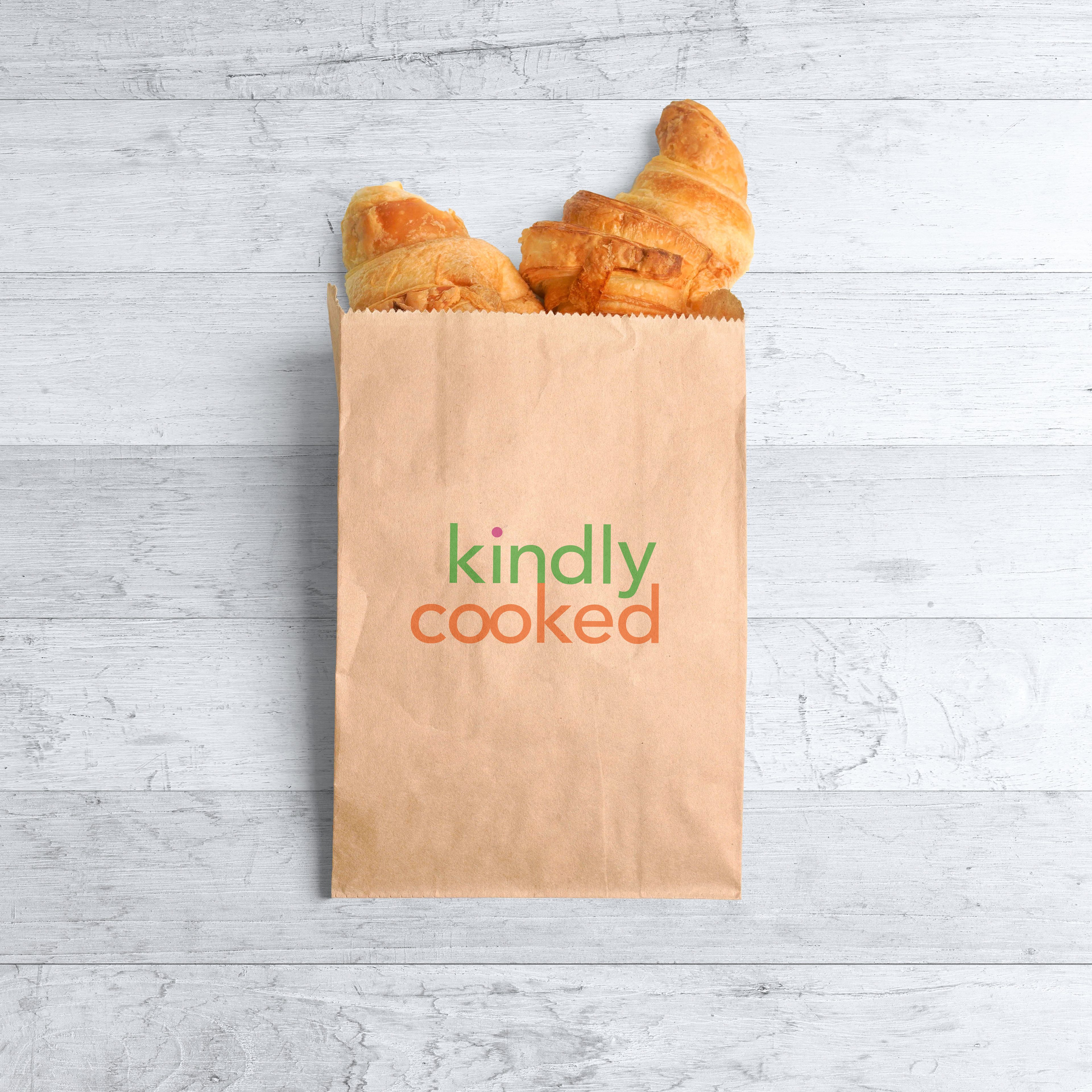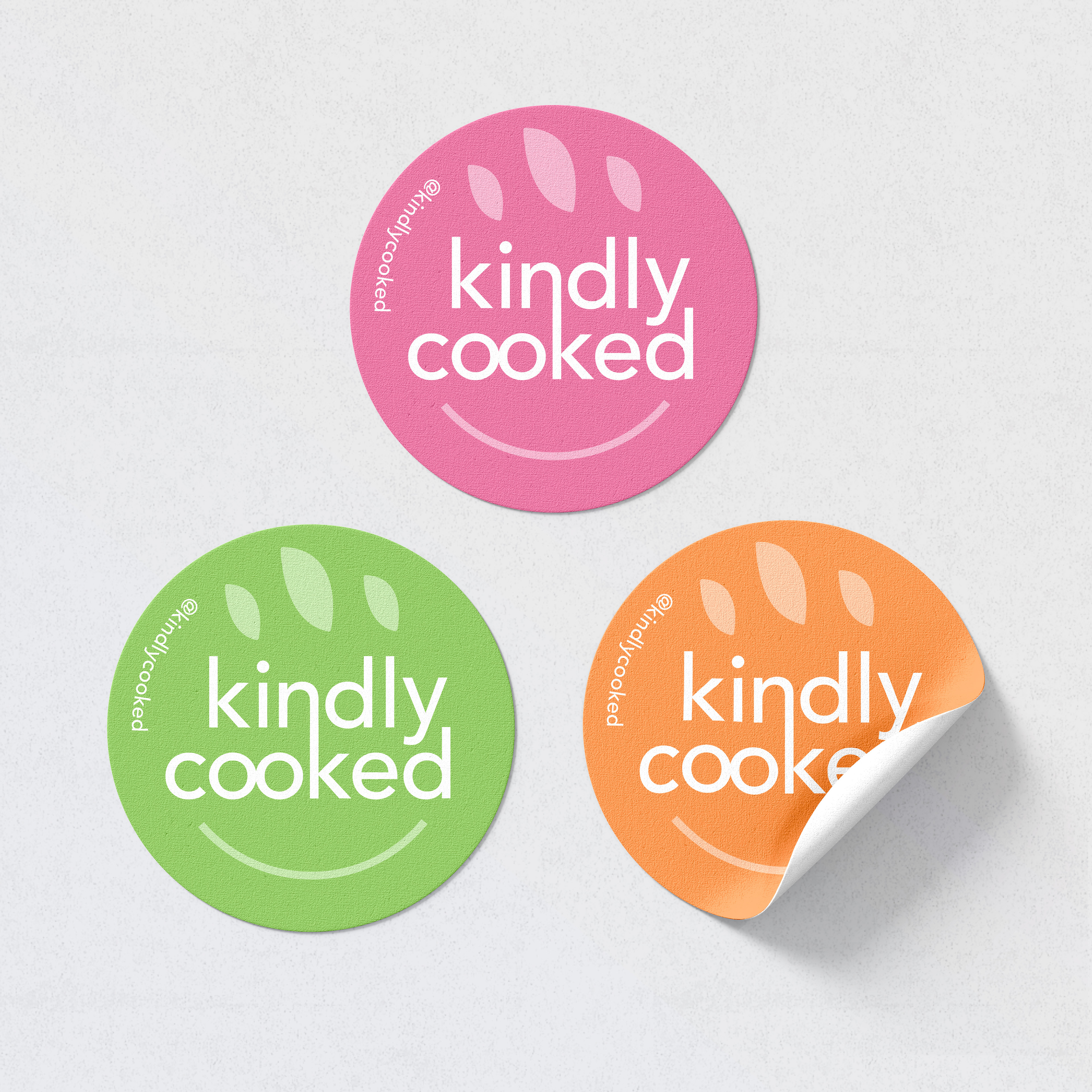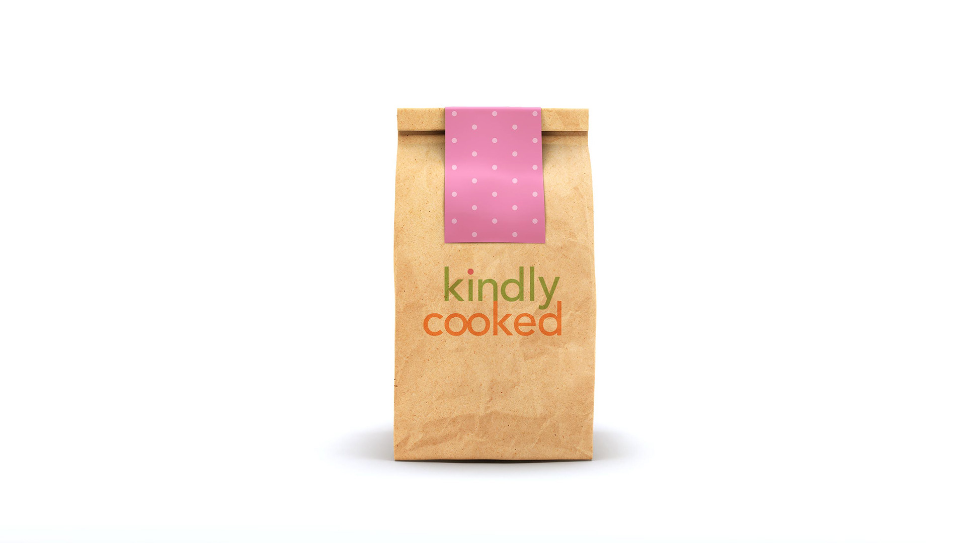
Objective: Design the brand identity for a new homemade bakery that feels happy, bright, and welcoming.
Process: First I established the color palette with my client to reflect the sunny Los Angeles vibes with a playful twist. Then I developed the logo suite through a series of revisions. The connected n and k give a sense of welcoming and inclusion that we wanted. The circular logo implies both a smile and a fresh loaf of bread. The glyph from the 'i' was carried over to create a brand pattern, as well as the font's curves which give a feeling of smiles and happiness. (*more pictures to be added)